Preparing Pax8’s brand for global growth
Challenge
Pax8 decided to change the core elements of its brand only a few months after introducing a brand evolution. It resulted in disorganization, brand insecurity, and a lack of practicality and accessibility.
The core brand needed to be restructured to have a defined basic structure that supports fast global growth, speed-to-market, cultural and digital accessibility, and user-friendliness.
Solution
I analyzed the core brand situation, determined adjustment needs, explored solutions, and then executed the approved solution followed by the company-wide implementation through cross-departmental communication and collaboration. I aligned corporate and regional marketing teams on the brand adjustments to explain the reasoning behind the decisions and to collect feedback.
Alignment with the Product & Engineering department ensured a cohesive brand experience with the Pax8 platform. Marketing departments, event and merch teams, and creative teams had clarity moving forward, efficiently ensuring on-brand communication in all markets.
Company
My Role
Creative Director
Services
Brand Evolution
Brand Guidelines
Templates, Toolkits, Libraries
Animation
Email System
The old branding before the first evolution
The Situation
The first evolution of the brand reduced the use of solid green. Pax8 moved to predominantly using black and a blue and green gradient.
A few months later, those brand elements needed to change again to satisfy the needs of regional teams globally and comply with accessibility.
The branding after the first evolution
More changes
When I started at Pax8, I was tasked with core brand projects and was involved in discussing the core elements of the brand. Together with the VP of Brand, we decided to remove a group of core elements.
The gradient because it was not WCAG accessible and it was used inconsistently.
The green because it looked dated.
Secondary colors because there was no use case.
The random use of colors in modules to avoid inaccessibility.
The use of underlining and colored text because of inaccessibility and also lacked consistency and control after translation to other languages. Colored text could be reintroduced with specific guidelines.
Those elements were removed without deciding on replacements leaving the company without a functional brand. During that time, the VP of Brand moved on to a new opportunity leaving the brand in limbo.
I directed my team across various marketing projects and experienced the difficulties the incomplete brand caused. I proposed a solution to set the brand up on a strong base for global application to the creative team leadership.
The new approach
I was tasked with presenting my concept to other teams across departments including global regional Marketing teams and the Product & Engineering team. My approach focused on the flexible use of color and providing clearer guidelines and hierarchies.
With the removal of green, blue started to become a dominant color, but I wanted to move away from just one color or gradient due to flexibility. Regional teams also requested to use less black and the need for warmer colors, because of the cultural negative connotations of too much black.
Refinement of core elements
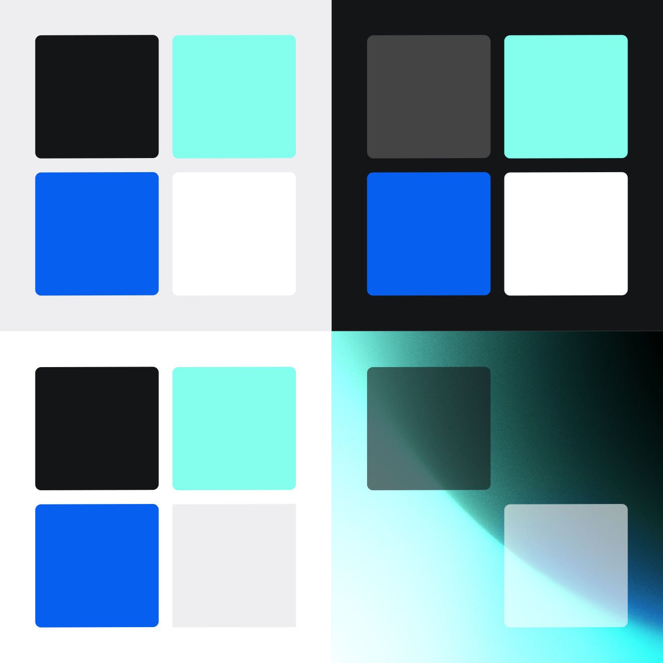
As a next step in the evolution, I proposed using mint as a cross-section between green and blue and as a brighter, warmer color.
I balanced the mint to be WCAG accessible with the Pax8 blue.
I replaced the light gray-blue with the new mint. That reduced the appearance of blue hues and provided a second primary color that worked well with the Pax8 blue, moving the brand away from a one-color brand. This change in color usage set the brand up to introduce more colors in the future without breaking its design language.
The Product & Engineering team supported the change to align the brand more with the Pax8 platform and provide more flexibility in colors.
After deciding on colors, the new brand textures replaced the limited and dark old imagery offering many options and secondary lighter versions for different regions.
For the modules, I defined new guidelines to show color usage based on module size, background, and content.
Applying the new design language
The result was a streamlined but versatile core brand that is accessible digitally and globally. I directed the Creative team to update the brand guidelines. The Copy & Content team also provided needed updates for the verbal guidelines section.
From there, I worked with the team on updating assets, standards, templates, toolkits, and libraries. The design system served as a comprehensive framework for maintaining a cohesive brand experience globally across all touchpoints.
Homepage header animation
Email systems
I directed the update of the corporate and marketing email systems and the creation of the component and style libraries in Figma. Designers utilized the toolkits with pre-built sections and elements to streamline the workflow. The new systems established email best practices and WCAG accessibility compliance.
Additional templates and toolkits
Landing page templates
Single-page and long-format document templates
Presentation template
Credits
Design Director – Jonis Perez
Design Lead – Matt Tout
Senior Graphic Designer – Kristian Champagne Patton
Copywriting – Katharine Flynn
Animation – Daniel Cervantes
UI/UX Designer – Alyssa Fuller
Presentation Designer – Andy Gayer


