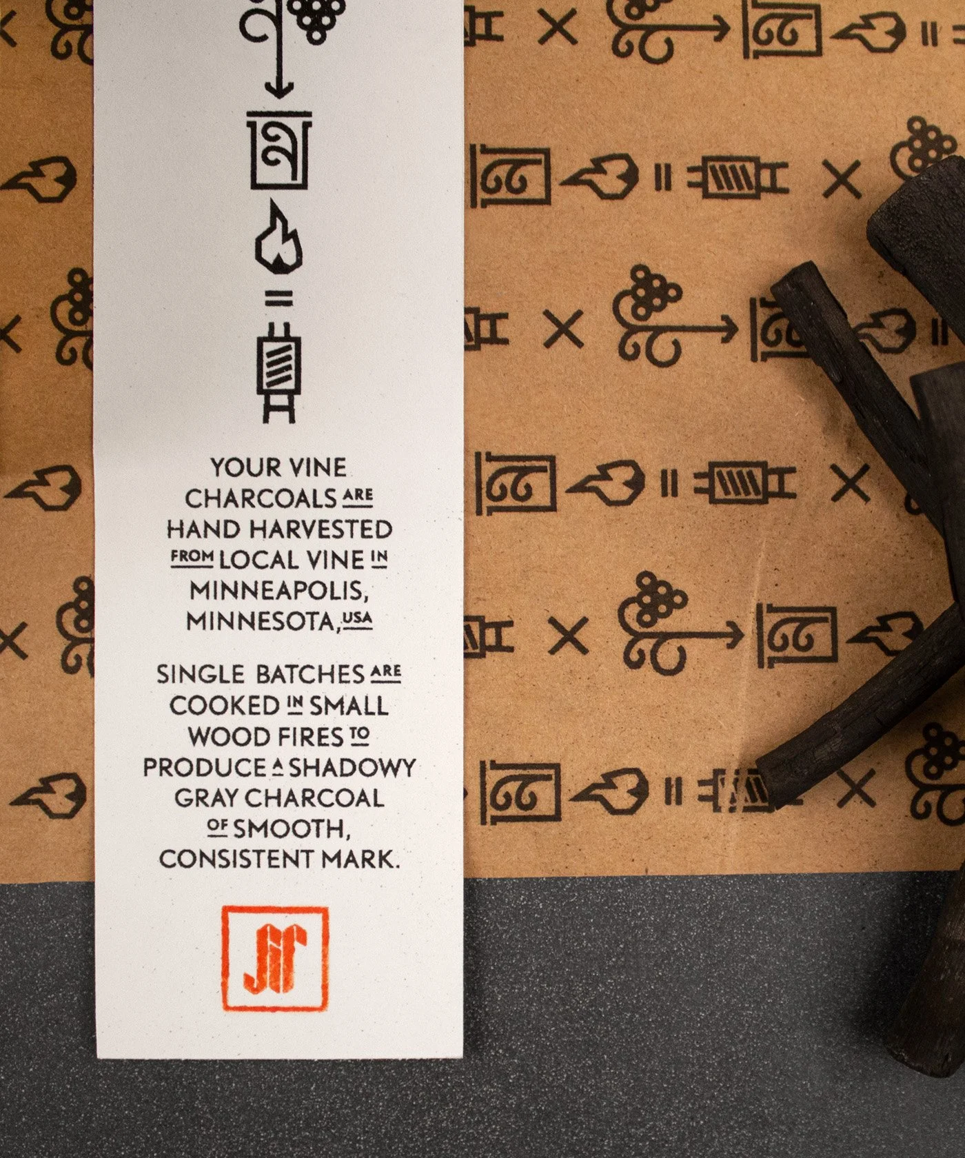
Branding and packaging a handmade story for SIR Design Studio
Challenge
SIR is a small start-up, crafting artist supplies and everyday objects. For production, they utilize traditional methods over commercial manufacturing practices. Their centerpiece product is drawing charcoal produced with hand-harvested, local vine cooked in small wood fires. The brand’s personality needed to emphasize the rustic, artistic approach and the care for historic production techniques, and pair it with a distinctly modern look.
Solution
As the name SIR implies, the brand focuses strongly on a male customer base who find satisfaction in knowing they have purchased a high-quality, hand-crafted product. The logo is an intersection between the obvious modern and old. This approach of marrying strict and playful elements starts with the bold black-letter logo and is carried over to the rest of the branding and packaging. Traditional heritage and value meet modern excitement and a playful tone.
Client
SIR Design Studio
My Role
Design Lead
Creative Director
Services
Brand Design & Strategy
Identity Design
Packaging Design
Print Production


