Case Study:
Blu Dot Accessories Packaging
Blu Dot is a furniture company that designs their products believing design should do more than just look good, it also needs to consider how we live and work.
Originally, Blu Dot was primarily an online furniture retailer with a few stores and certified retailers. As they grew, they opened more stores nationwide, with the long-term goal of building a strong physical presence in important urban markets. When this project started, Blu Dot was focused on opening more stores and making them a shopping destination, not just a location for browsing and ordering furniture.
With the expansion of stores, Blu Dot wanted to introduce smaller items into their stores, such as accessories. Up until this point, smaller products were mainly sold online and shipped in ordinary cardboard boxes.
The Ask
I was tasked to create an enduring packaging system that would house smaller products and accessories and create a thoughtful customer experience. The goal was to have the products more prominent and available in-store to spark purchases. The packaging system needed to provide flexibility to grow from 178 existing smaller products to over 250 products over the next 5 years, including hard and soft goods.
Expectations
On-brand design
Simple design
Needed to be designed to feel like a gift, even if it wasn’t
The unpacking process needed to involve surprise and delight for the customer
Production of the packaging needed to be consistent no matter where it was produced
All aspects of the packaging and customer experience needed to keep sustainability and recyclability in mind
Boxes would be displayed in-store
The Target Audience
The target audience was current and future customers. The new packaging also had to build brand loyalty and make Blu Dot more accessible to an audience that otherwise may not engage with the brand due to the wider offering of lower-priced entry-level products through competitors.
Key Message
The experience doesn’t just match but elevates the values of the Blu Dot brand; design-first, quality, and value.
Main Challenges
Consumer packaging was new territory for everybody involved.
Connecting the request for simplicity with surprising and delightful moments throughout the customer experience, from browsing to unpacking.
I undertook a lot of exploration to address and satisfy the conflicting viewpoints on needs and functionality between the two CEOs and the team responsible for setting up and planning store merchandise layouts. Beyond the packaging itself, we needed to explore and decide upon the unpackaging and store experience of the customer.
Measure of Success
While a measurable goal for this project was not specifically provided, the ultimate goal of continued business growth and increased foot traffic to stores was the desired outcome.
The Research
Research kept the process moving efficiently. I prioritized research to have an informed foundation on industry packaging to assist in decision making. This played a key role in developing and selling through concepts relevant to the ask and guided the countless team discussions and presentations to make informed decisions.
Identified display opportunities in stores; free-standing shelves, wall shelves, build-in coves, and platforms
Competitor research, such as Floyd, Crate & Barrel, MillerKnoll (Herman Miller), Hay, Vitra, West Elm, or Design Within Reach
The research involved orienting myself to our competition’s packaging systems, commonly produced box types, how the box opens, inside of the box appearances, shopping bag options, opportunities to surprise and delight during the unpacking experience, and in-store displays, while keeping sustainable and recyclable materials in mind.
Packaging examples that represent the most common boxes used based on my production vendor research
Surprise and delight inspiration included inside-box messaging, patterns, cards, booklets, textures, instructions, and advice
The Concepting
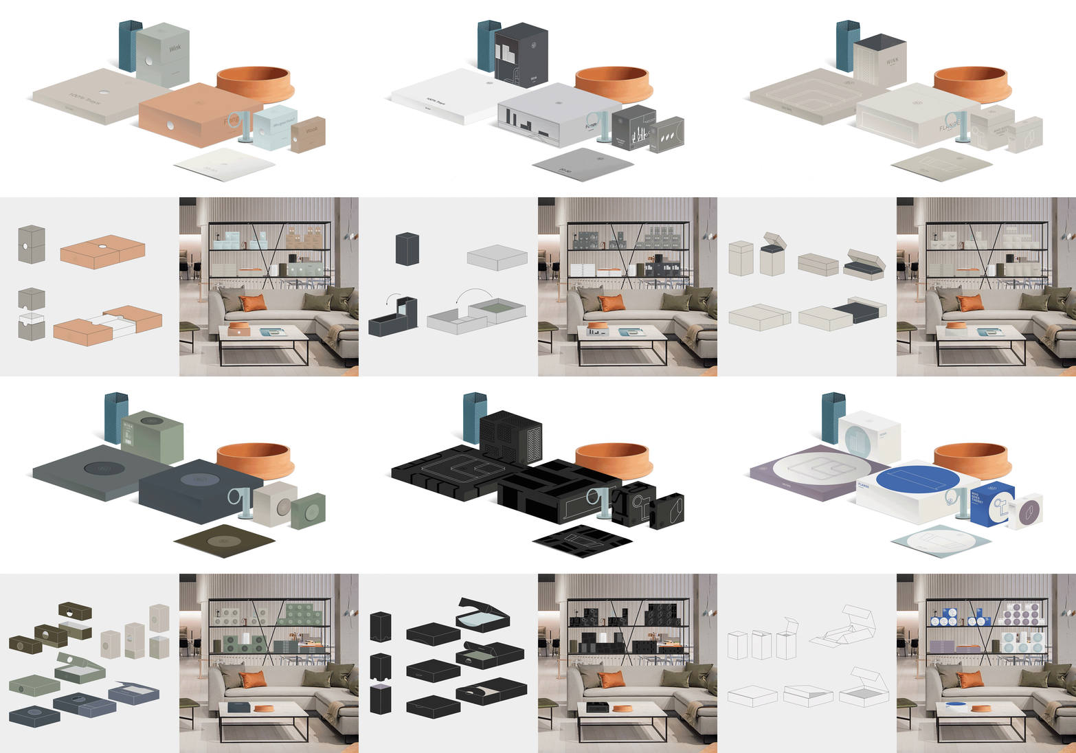
I took a simplistic approach in the early stage of concept exploration yet on a wide spectrum to get reactions from the two CEOs and the rest of the team quickly.
My team recommended exploring busier options in addition to my simplistic concepts to cover the entire range of possibilities. Ultimately, the two CEOs desired extreme simplicity with a surprise and delight element. With a chosen direction, I put an extra emphasis on color study and exploring the best tactile experience to achieve the CEOs’ desired direction.
A small selection of initial concepts. The ideation phase went through multiple rounds of refinements.
The Color Study and Prototyping
After narrowing in on a direction for the design, I started with color exploration and prototyping. I collaborated with the store team to discuss my color research and material testing. Together we decided to explore a fabric-wrapped box to increase the tactile experience and for a higher quality and higher value appearance.
Elaborate color study leveraging Blu Dot’s brand, its furniture, and commonly used colors in their materials. It would ensure the packaging system fits well with the surrounding furniture without taking away from them in stores.
Multiple discussions took place around the best color assignment to ensure no color would take over and all colors would complement the furniture in the stores rather than overpowering them.
Store display mockups show how the packaging interacts with the displayed small products and accessories. Below are examples of the inner-box color exploration. I felt with a colorful outer box, the inner box needed to create a complementary contrast when unpacking.
We ordered a few rounds of fabric in order to test how colors appear in real life, in different lighting situations, and the tactile feeling. We also ensured that the fabrics we picked could be consistently produced in various production facilities globally.
Together with the fabric, I tested different logo applications and sizes on the fabric such as blind embossed, white ink embossed, silver ink embossed, and raised. With the CEOs, we decided on the silver ink embossed logo.
Prototyping allowed me to test the different unpacking experiences and usability of materials. It also allowed me to make informed decisions on additional details such as stickers, tags, cards, or inner-lid font sizes.
The final selection of fabric colors was a well-balanced mix of lighter, darker, vibrant, and more neutral colors. The inner box color was a light neutral to compliment the colorful outer box. A backup color was selected to ensure the packaging system could grow long-term.
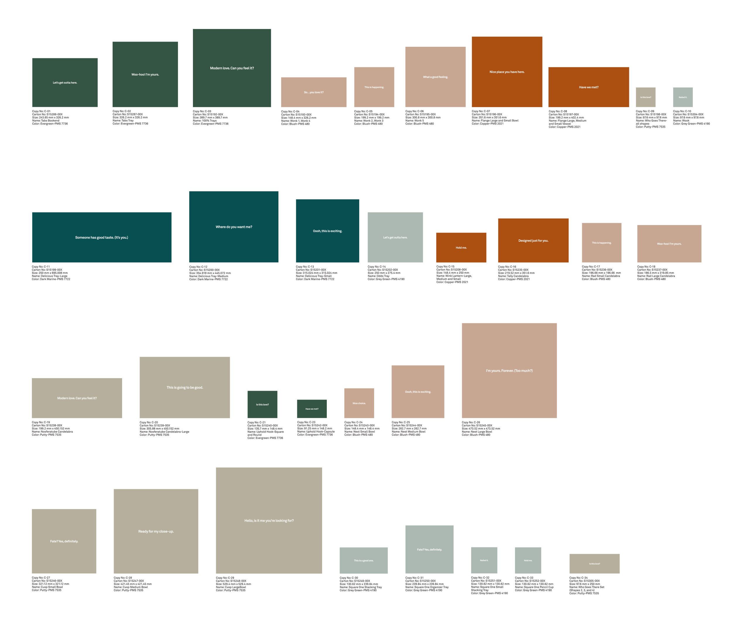
Following the final color selection, I worked with the store and fulfillment teams to assign each color to a box based on box sizes and SKU numbers per product line.
The font sizes for different lid sizes were determined by the length of the inside-lid text and the white space-to-text ratio. I worked with a copywriter to ensure the text didn’t exceed a certain length and character count.
The Details
Getting closer to a final packaging design, I focused on additional elements to the packaging and the customer experience. Bags, cards, sleeves, booklets, gifts, stickers, soft good tags, product info tags, you name it. Everything needed to be explored with the overall experience in mind, and mocked up for presentations to make the ideas tangible and sellable to the CEOs.
I worked with the fulfillment department to determine what product information needed to be included on stickers and tags, and to determine the hierarchy of importance. Together with the two CEOs, we discussed the sticker size and positioning.
The product information system had to work for different sticker and tag sizes
The orientation, positioning, and usage of the sticker or tag were important to consider for each layout. This bedding tag would be flipped up to read the information.
We landed on having a simple card inside each box to limit our use of materials. The card informs the customer about the sustainable nature of the packaging for customer awareness and a QR code with care instructions for the purchased product.
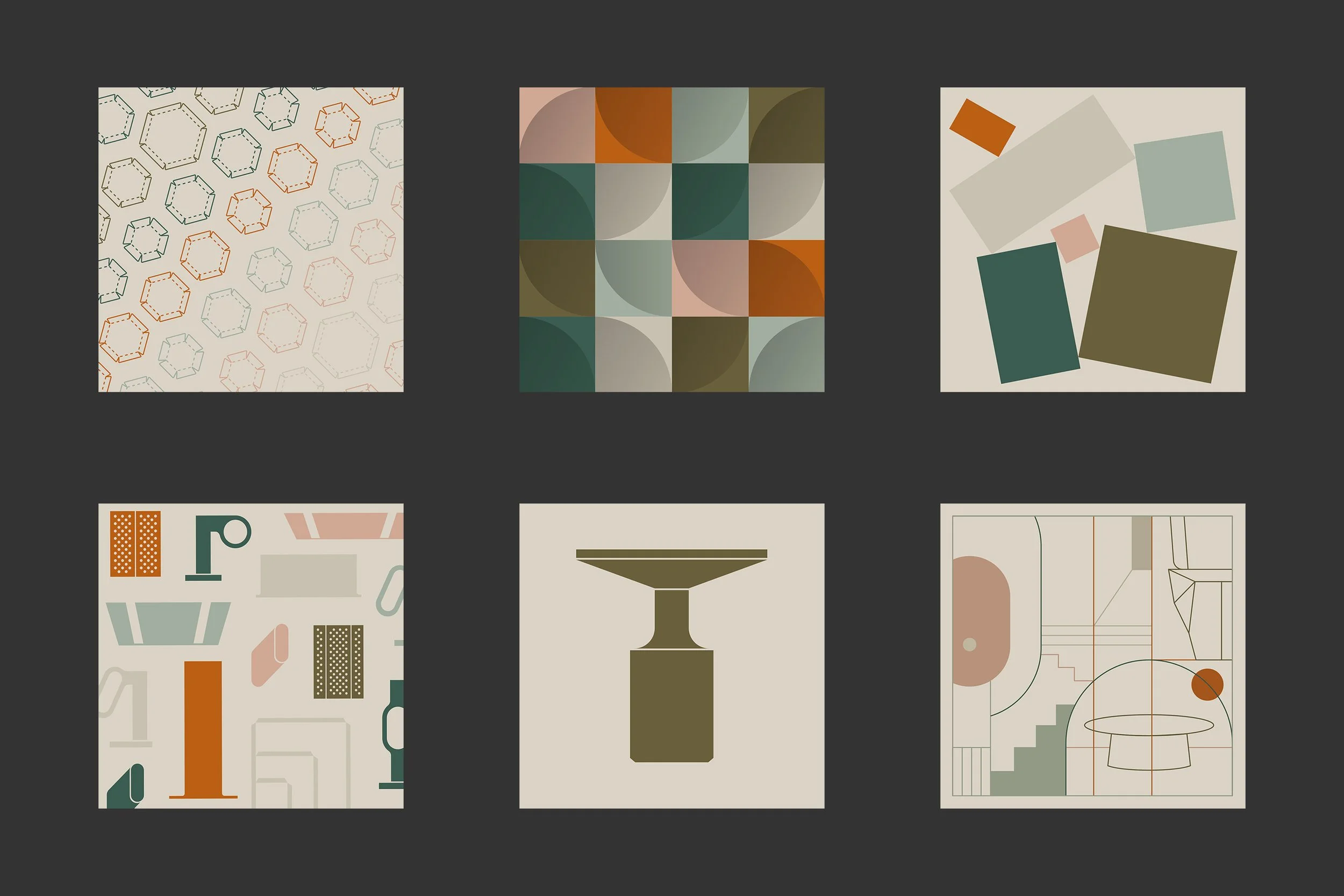
A selection of the card pattern concepts presented
The final front and back of the card. I designed multiple pattern variations that were created for the approved direction.
The product itself is wrapped in Kraft paper for protection. The Kraft paper supports the sustainable cause and is also a part of the unpacking journey. As part of the surprise and delight moments, a customer will experience many changes in colors, materials, and textures including the final product reveal.
After the colorful outer box, the Kraft paper prepares the neutral stage for the maximum impact of the purchased product’s material and color, which is mainly metal, marble, or wood.
The Shopping Bag
Blu Dot was looking for a sustainable paper shopping bag to use in all stores. Two sizes were needed to fit the different accessories comfortably.
The bag and handles had to be high quality, recyclable, and strong. Keeping in line with the ask for sustainability and recyclability, the ink used on the bag needed to be non-toxic and safe for recycling. The handles also needed to be long enough to be carried over the shoulder, but not too long to touch the ground when held.
A small selection of concepts. I focused on making the bag a large canvas with an impactful logo to create a stand-out design. Then, the bag can be seen and recognized across the street or at the other end of a city block.
I led the print tests exploring matte, gloss, and clear gloss printing for the logo; and how many layers of ink are needed to achieve a rich black and vibrant blue logo


